Lucien's Portfolio V5.0.0
Ragdoll Royale
May 2022
🚧 This page is currently under construction!
Ragdoll Royale was a project I worked on for INFO 4152: Advanced Topics in Computer Game Design. The game was written in C++ using the course's in-house CUGL engine. I worked on both design and programming tasks for this project, centralizing my focus around the game's audio features and level design. As part of the course's requirements, the game targeted mobile devices, which brought with it a bunch of challenges -- especially when it came to audio and playtesting.

Gameplay
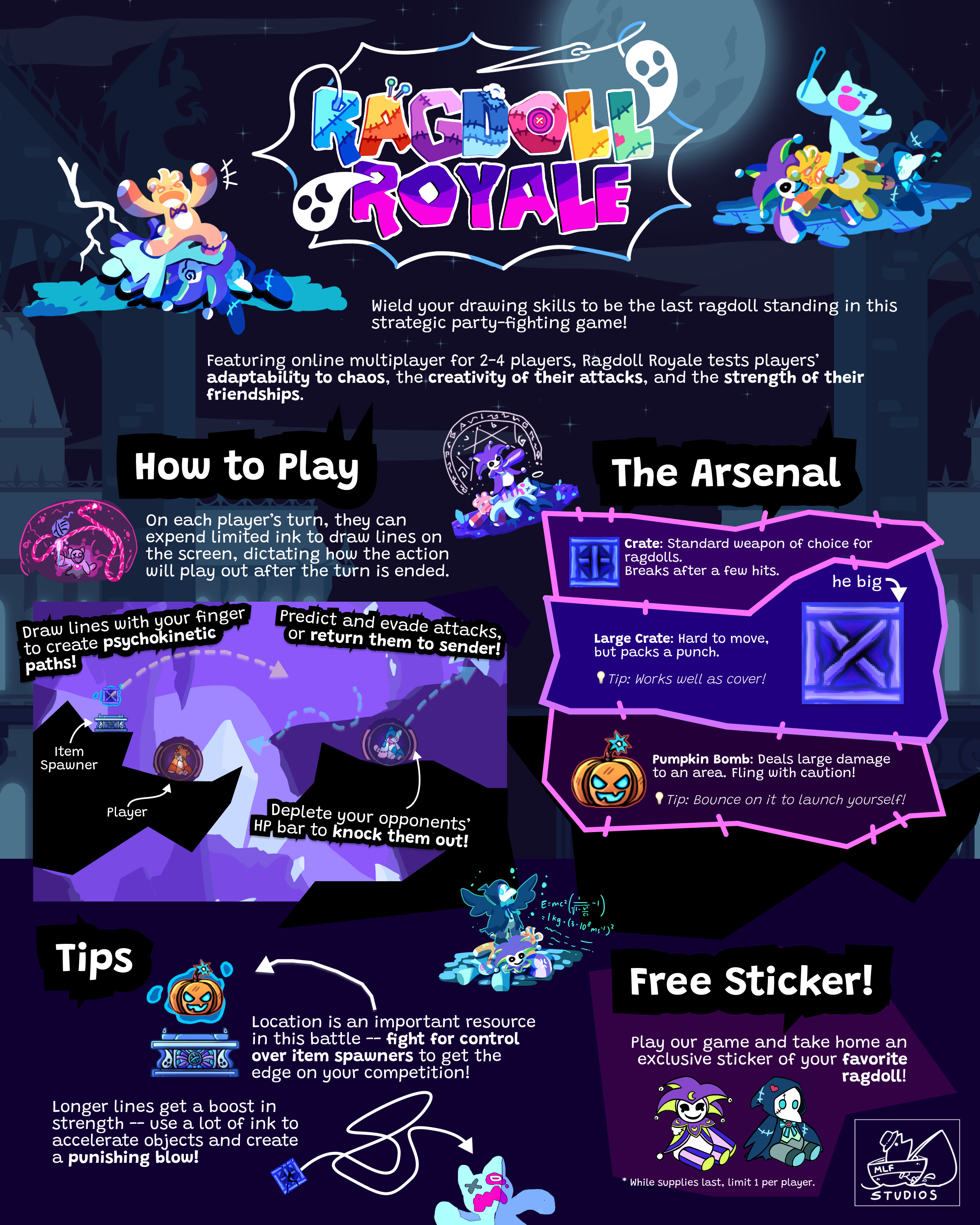
Our game was best described as a turn-based drawing/fighting/party game, supporting up to four players through networked multiplayer. Each player controls a ragdoll and its psychokinetic abilities, battling to be the last one standing. The gist of the gameplay is that on a player's turn, they can expend "psychic ink" to draw paths within a limited radius that, upon the end of the turn, drag and fling objects along themselves. Through this, players can throw objects and characters around the map, whittling away at opponents' health by setting up collisions or planning ahead for combos and chain reactions.
Players have to carefully control their position in the stage to ensure they had an advantage over their competition. For example, spawners drop objects over time that players could use as ammunition, and having a height advantage to let gravity work in your favor is extremely valuable. This made it critical for each player to maintain access to spawners and objects, without being in a position too exposed to attacks by others exploiting the geometry of the map.


Design Process
Early in development, we put together a paper prototype for our game. At this phase, we primarily wanted to investigate how players valued the risk of exposure to others' attacks against the reward of being in close proximity to "power-ups" or useful items, in situations similar to our planned game. We modeled this dilemma using a three tile-based maps of increasing difficulty (difficulty corresponding to increasing size and complexity of each map allowing for more choices of strategies, and/or more dangerous locations paired with greater rewards). One-way walls, while not a feature in our final game, made it easy to create these scenarios in this prototype.


We found that it was tough to encourage players to go for the most valuable power ups in the context of even a little risk. It may just be that players didn't feel confident weighing that option while they will still learning to play the game, but the dominant strategy tended to be finding ways to minimize risk first and then figure out how to use nearby lower-value objects to maximize damage against enemies. Since we were presenting our game at a fast-paced showcase event where most players would only have a few minutes of exposure to it, we learned that we needed a way to entice new players to put themselves into riskier positions if we wanted to present as much of our game as possible to as many people as possible. Generally, this was the question we sought to answer with future digital prototypes.
Level Design
Our game's final release contained ten stages. In hindsight, it would have been wise to focus a bit more on quality over quantity, especially as our game's stages are expected to be replayable due to our multiplayer-focused gameplay, and players at our showcase would only experience one. But at the cost of quite a few hours of sleep, we pulled off ten anyway! Each stage was constructed from design patterns we identified during early playtesting (and found to emerge organically over time) and centered around a specific behavior or theme that did end up making matches feel vastly different on each. Below are some screenshots of our level designs in the Tiled editor, and in-game.


I was also tasked with implementing some of the loaders that built up our levels at runtime from a JSON representation -- specifically those for the level decor, and invisible walls. From this, I ended up getting pretty familiar with the level design process end-to-end, and was able to use knowledge of implementation to clean up designs (and vice versa).
Audio
For this project, I moved from using LMMS to Ableton as my DAW software. I didn't want to default to the fake-chiptune-esque style I usually used -- it wouldn't align with the aesthetic we were aiming for -- so I thought using a new tool could help provide a blank slate of sorts, with different plugins and instruments available. It was a pretty intimidating change, but the higher quality default plugins and session workflow provided a lot of benefits when composing for this game. It was a great tool to use! ... while the free trial lasted.
The initial plan was to assign each player an instrument, and layer individual melodic tracks for each over the background music during the respective player's turn. As I started working on more programming tasks, this quickly moved out of scope, and I instead produced three (four, counting the tutorial music) sets of quiet/"drawing" and chaotic/"simulating" phase background tracks, alongside one menu theme. The tracks are organized on this page!
Alongside composing music and sound effects, I was also in charge of implementing all the audio systems in our game. I hadn't worked with game audio on such a low level before, managing slots, effects, and audio graph nodes in efficient ways and getting them to react and modulate according to the state of the game. Getting over the initial hump of C++'s learning curve in general was also a challenging task. It was extremely satisfying when things clicked into place (even more satisfying when the clicking was gone), and we ended up with a pretty a smooth aural experience that wasn't going to blow out anyone's speakers across both iOS and Android devices!
🡄 Back to Projects